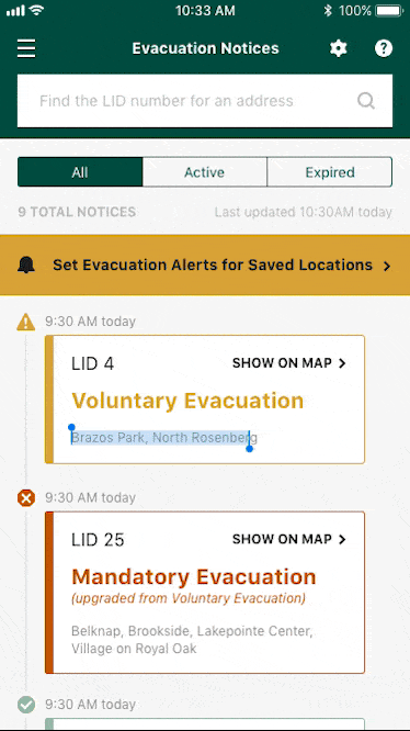
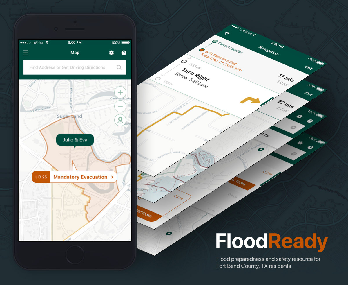
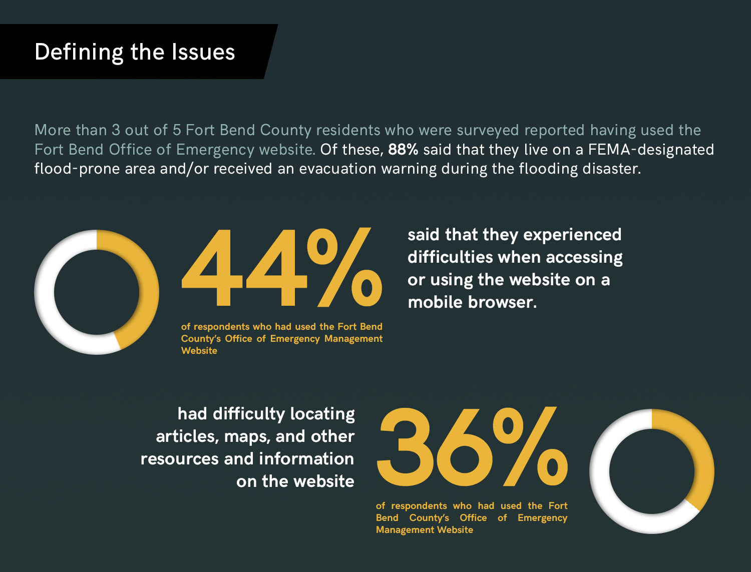
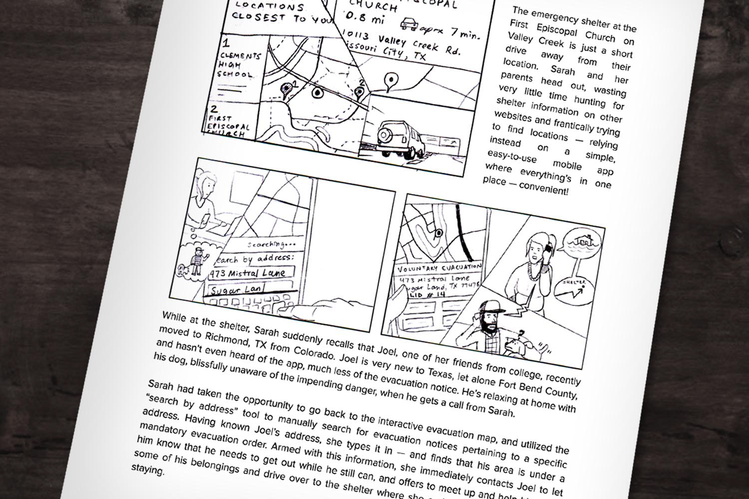
My family and I, like so many countless millions in the greater Houston area, were deeply affected by Hurricane Harvey and the record-shattering flooding that caused so much chaos and destruction in the weeks following the storm. During this time, residents of our county made use of a very useful website maintained by Fort Bend's Office of Emergency Management to stay aware of evacuation notices, road closures, and other important news and incidents related to the hurricane and flooding.
I had experienced several issues with the site, as did several friends, neighbors, and community members with whom I had spoken after the flooding had subsided. Inspired by the stories I heard and the concerns raised therein, I set out to design a tool that could help residents of the county, many of whom were caught completely off-guard by the magnitude of the disaster, be better prepared and better informed when the next big flood hits.
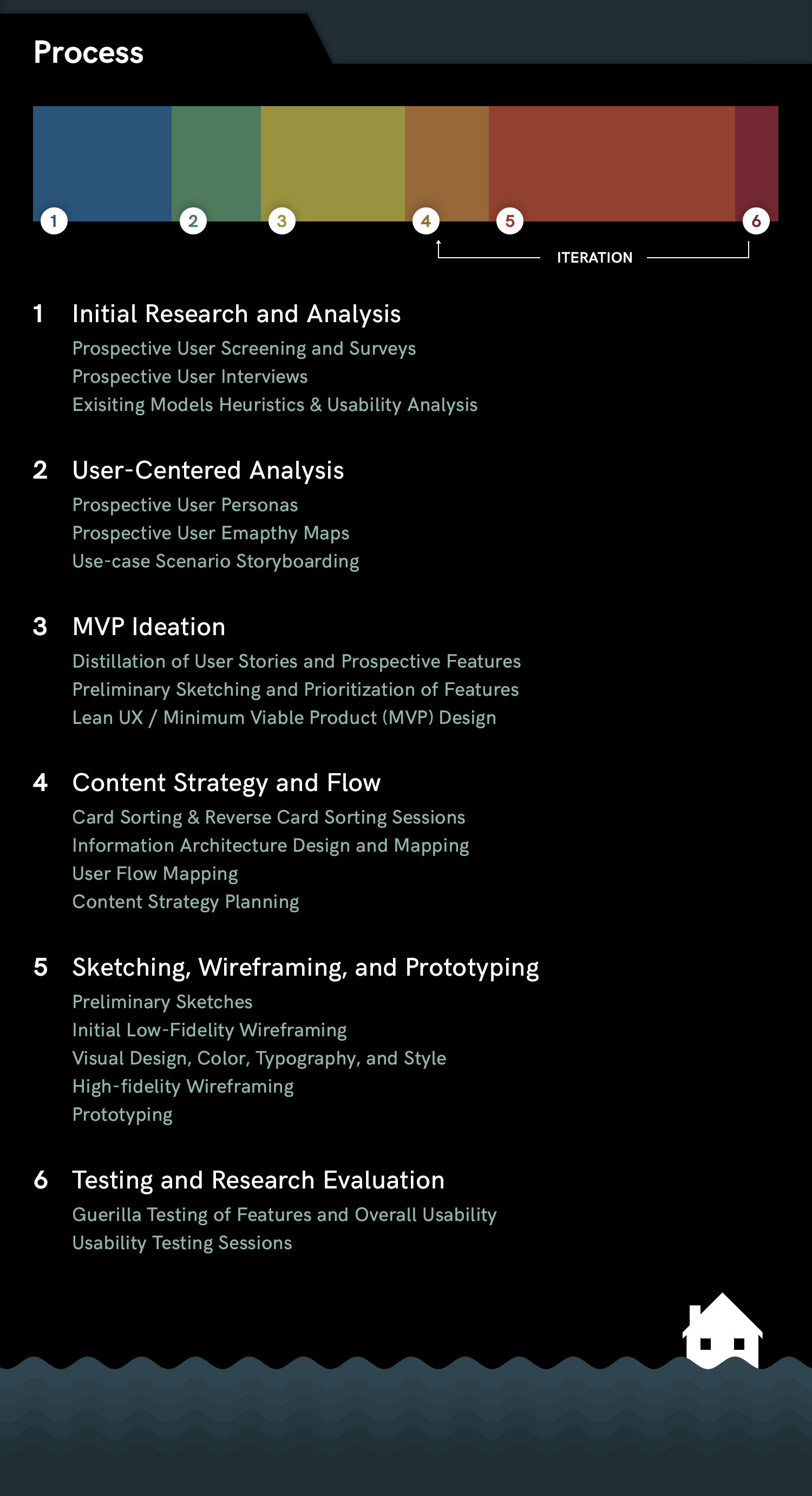

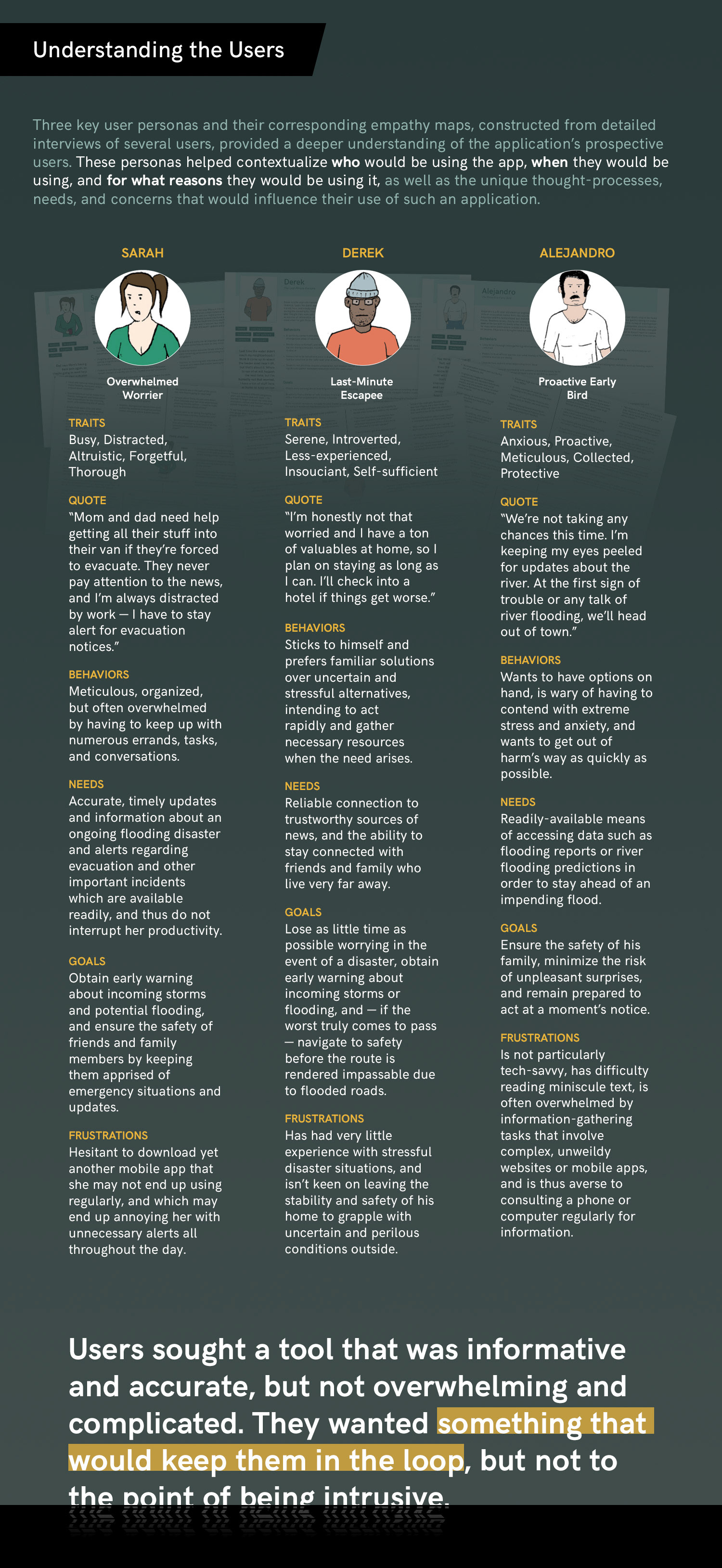
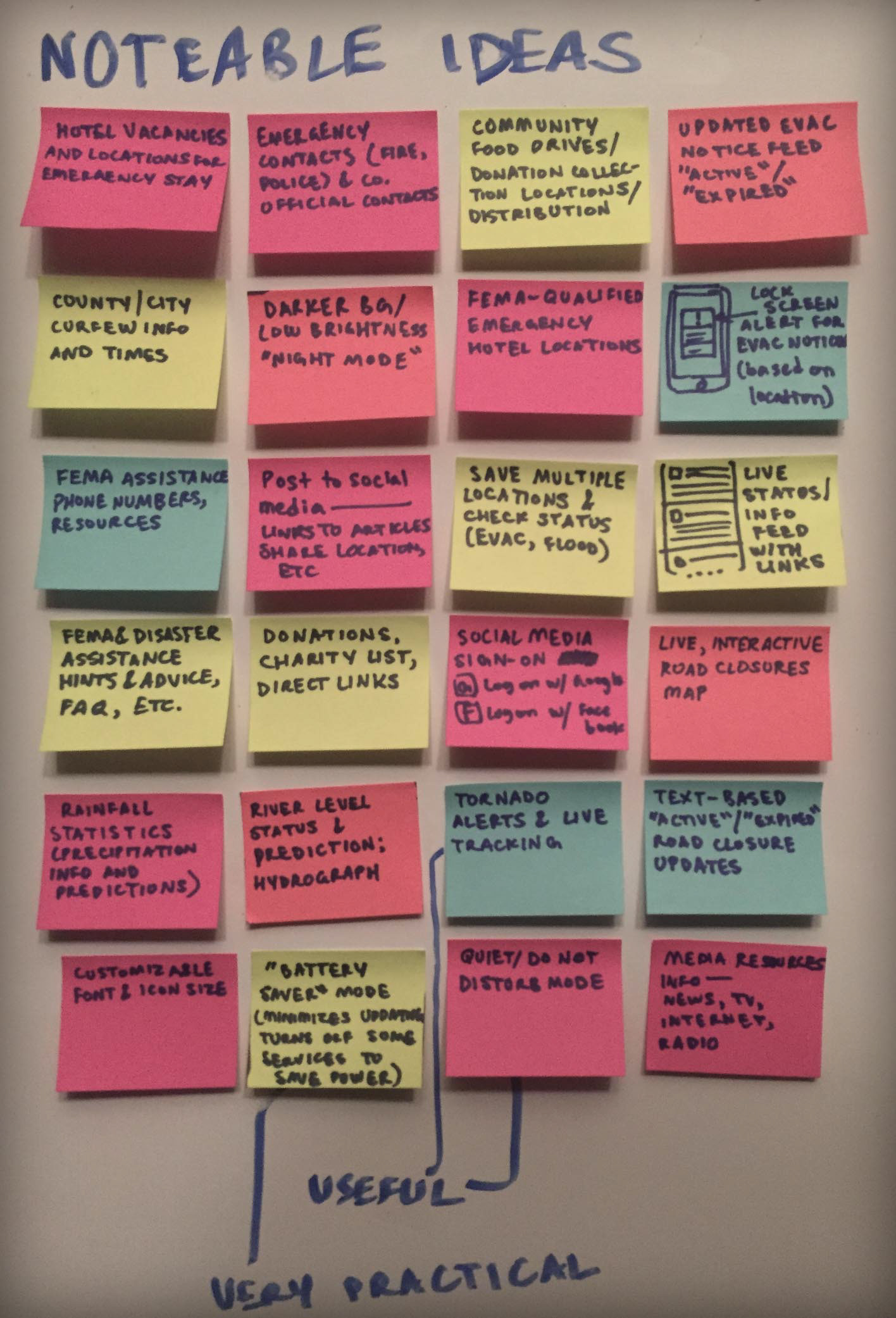
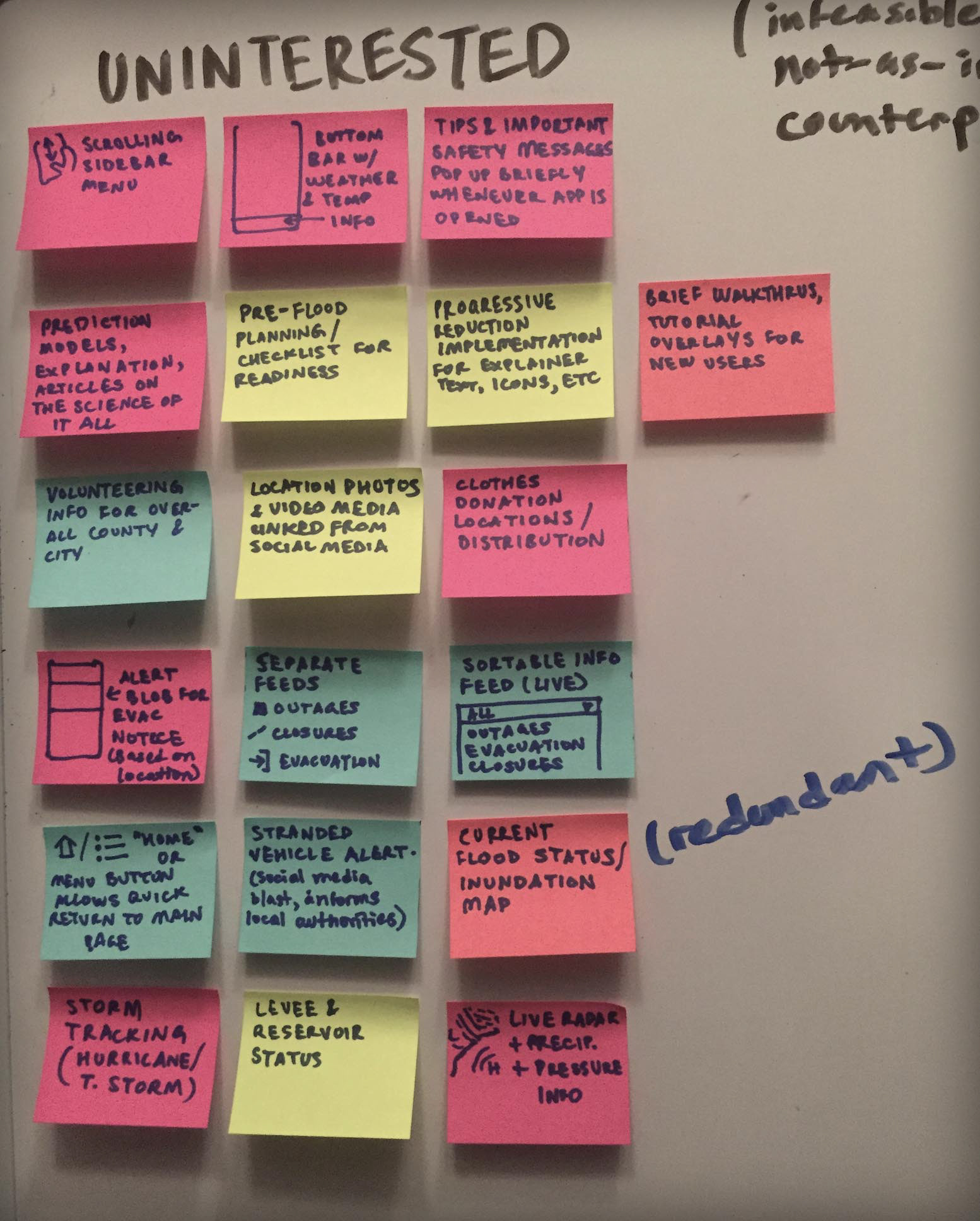
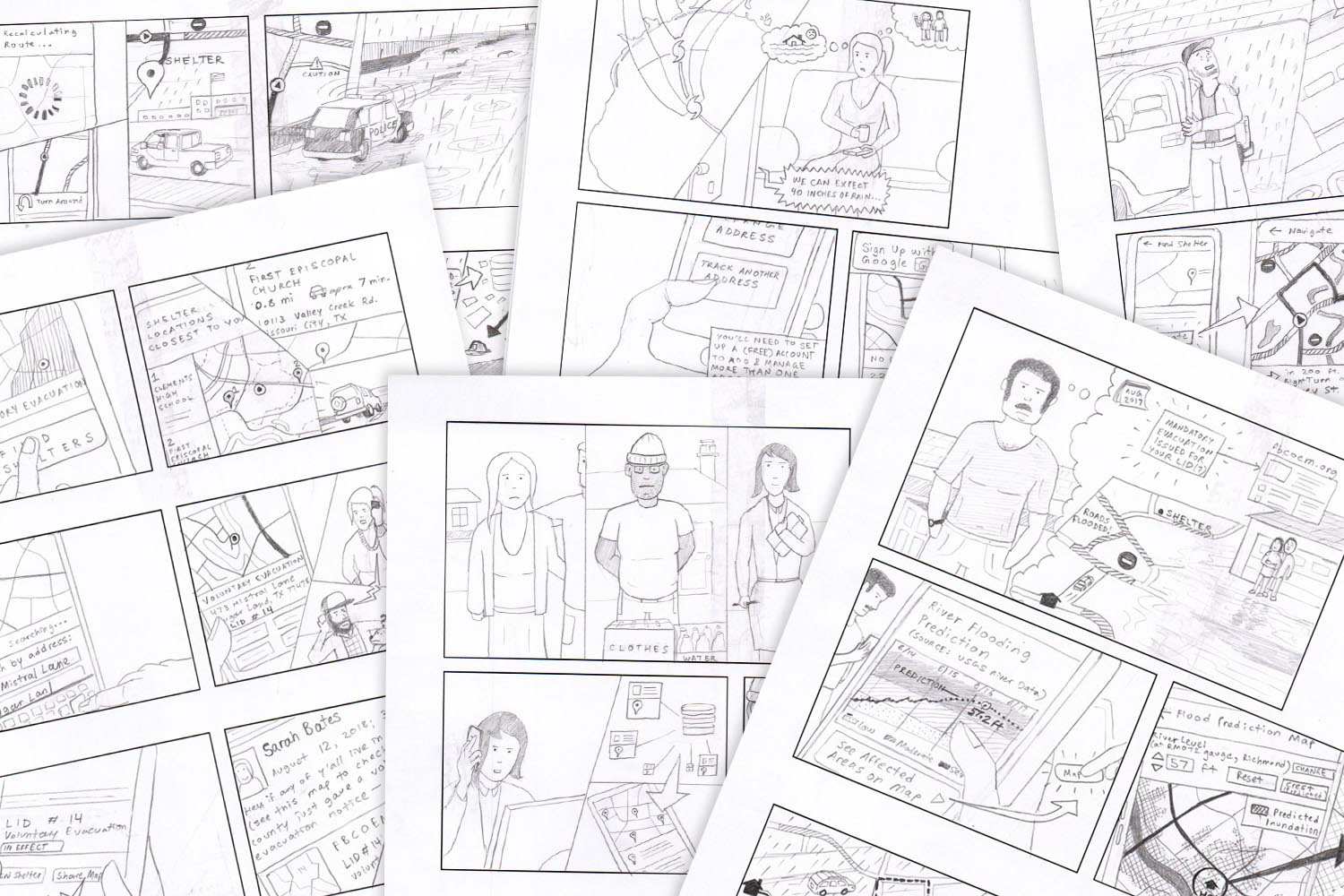
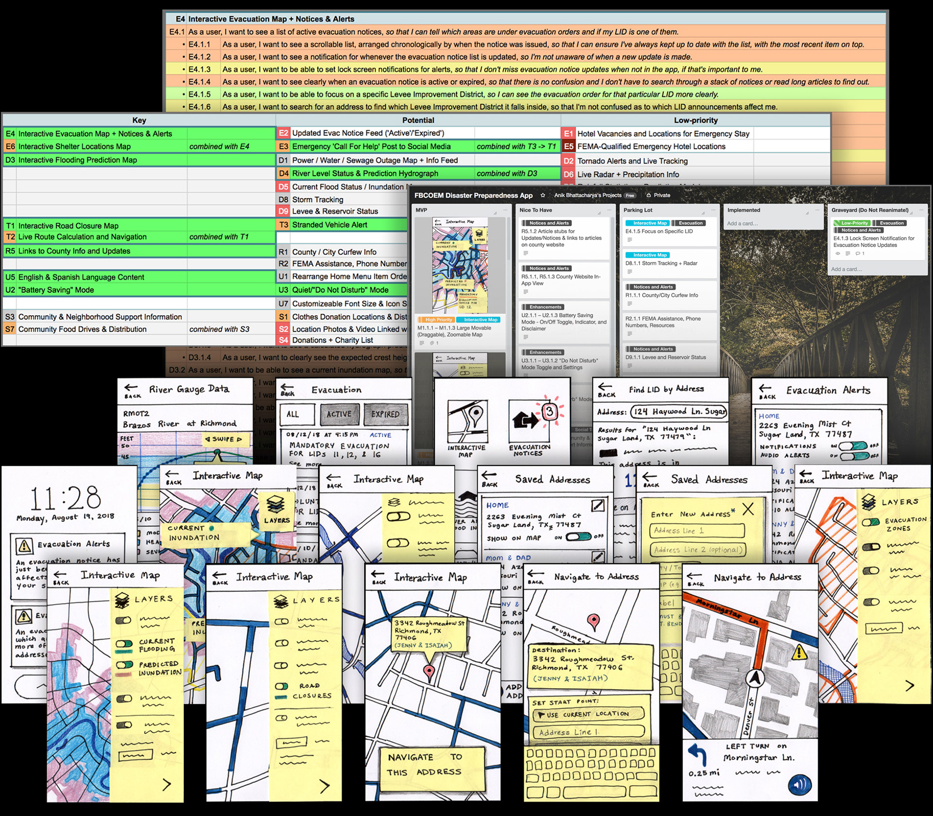
An initially large list of prospective features derived during the early brainstorming and ideation stages was distilled down to a list of key "must-have" features, prioritized based on the needs and concerns of prospective users who had been interviewed. I drew storyboards to illustrate the scenarios in which these features would be utilized and how users would interact with them.
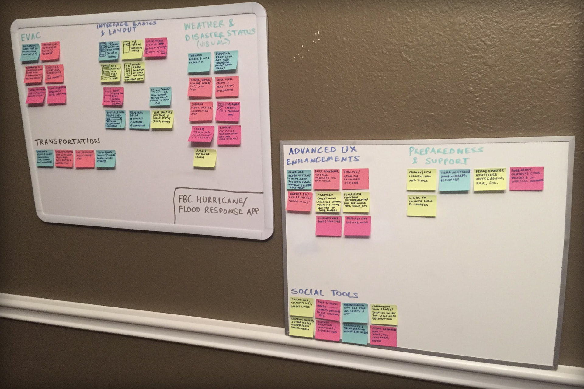
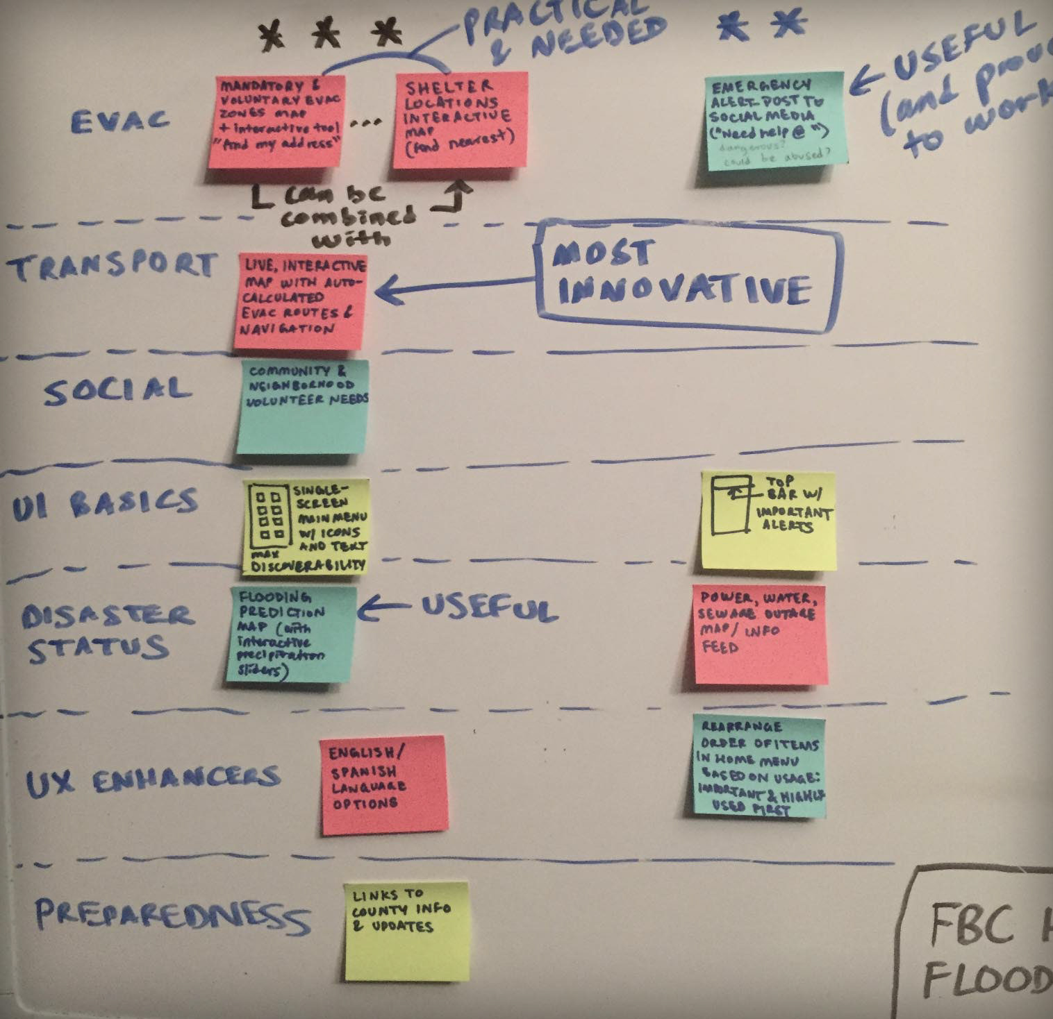
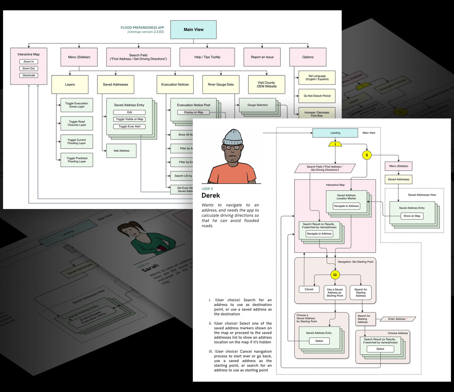
I sorted these key features into a comprehensive list of "user stories", detailing the major interactions and user needs pertaining to each feature. I then created some initial sketches, illustrating a screen for each feature or tool. These were organized on a Kanban board in categories based on the priority of each feature.
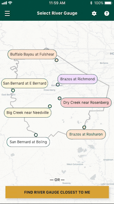
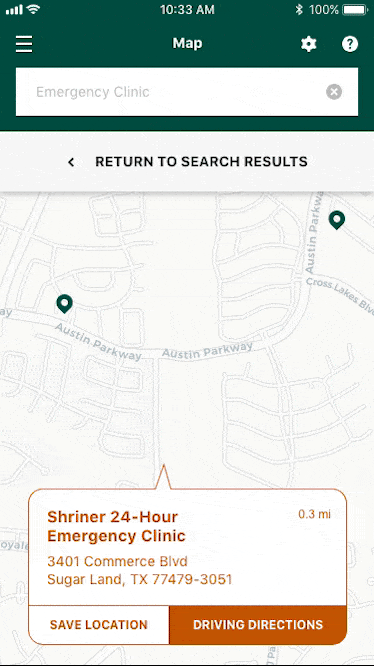
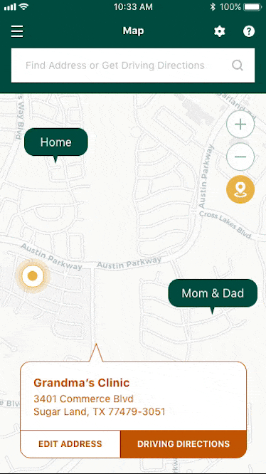
Cards sorts and reverse card sorts helped refine the overall content strategy and organization of features within the app. I created detailed diagrams to clearly illustrate the interaction flow that users would take in order to perform certain key tasks, such as obtaining driving directions or finding the current height of a river at a specific gauge.
Additional sketches and low-fidelity wireframes helped to further elucidate the screen-to-screen flow, refine the interaction design, and adapt my ideas to the unique characteristics and constraints of the iPhone medium.
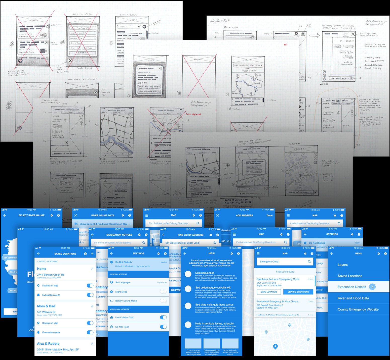
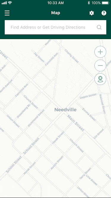
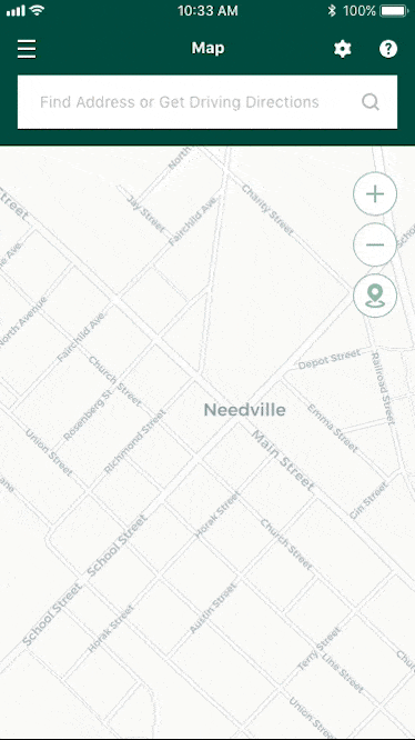
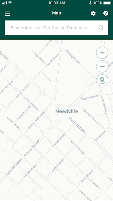
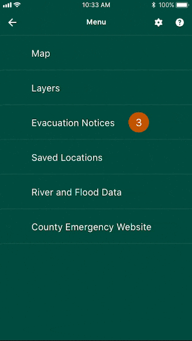
These initial sketches and low-fidelity wireframes were then significantly enhanced in terms of content, style, and overall completeness of flow in order to create the high-fidelity wireframes which more closely resembled the final product. I then created an interactive, semi-functional prototype of the application using the InVision app.